This page contains Amazon Associate links. As an associate, I may earn commission from qualifying purchases.
A little insight into why and how I changed the cover designs and the symbology behind them.
First off, I want to say thanks to all of you who have bought and read my books and for the feedback and love they’ve received since I first published back in 2019. It helps me grow as a writer. I know, I know – cliché. But it’s true, and I do take that feedback into consideration and the pleas for characters to return and new adventures in those universes when deciding what to write.
I’m totally stoked to announce my fiction works have shiny new covers and are available now live on Amazon. Why have I changed them? Well, trends change and what catches people’s eye changes with them. Plus it’s a great excuse for a fresh new look.
As an indie author it can be really tough to stand out in the crowd so it pays to keep an eye on what tempts folk to pick your book out of the millions of others. Another aspect I hadn’t considered was how covers scale down for phones and thumbs. It’s certainly not breaking news that social media platforms drive trends, but again wasn’t something I’d really thought of. Now, these covers scale down much better and I believe hint more effectively at what a reader can expect to discover inside them.
Time for a little historical tour …
Symbionts
I have a lot of love for this collection of short speculative sci-fi stories. It’s a gathering of tales which went through the competition mill over and over. Several eventually received honourable and silver honourable mentions, which was nice. It was when compiling them into a collection I really came to see the throughlines and themes threading my writing together. In this case, whether humanity is truly in control of anything.
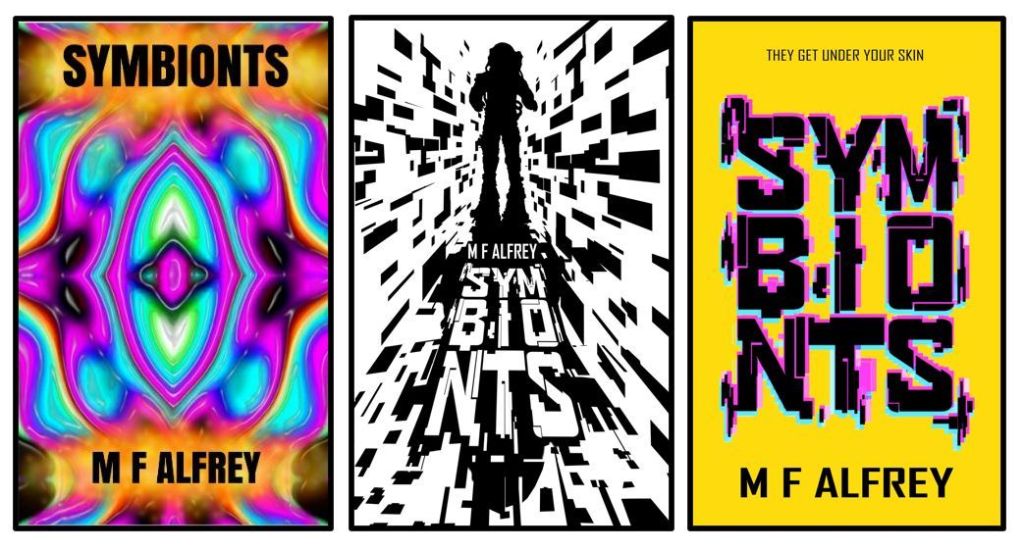
The first cover was a bit crazy. Honestly, not sure what I was thinking. Let’s move on. The second cover was designed with sci-fi greats like 2001 A Space Odessey and the retro vibes of the decade in which it was released. The astronaut being a key figure in the stories and the fractured bit-like elements and QR code style font bringing it into our era. Whereas now, with that bright yellow background and neon glitch art version of the QR code, the cover hints at the more cyber punk style stories favouring big and bold over the previously crowded cover.
Click here to browse Symbionts on Amazon
The Sixth Dawn & Other Stories
This collection of short fantasy stories was always hard to pin down for me in a cover because of the diversity and style of the stories themselves. The original cover was rather dowdy and dull. It was supposed to represent an old leather journal but my skill back then with Krita (the open source raster graphic editor I use – it’s awesome BTW) was basic. Yet with time and practice I feel I’m getting there.
The next iteration was when I was going through a phase of experimenting with silhouettes. I was somewhat obsessed with the works of Jeffery Alan Love and there’s a lot of influence coming through there. If you’ve not seen his work, you should totally check it out!
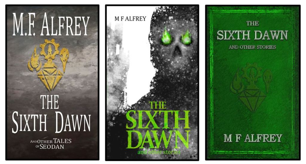
However, the second version of the cover, despite showing one of the main antagonists in Yargi’s story, missed the mark and doesn’t showcase the overall feel of the collection. So, what did I do? I actually went back to the original idea of making the book appear like an old leatherbound tome but with an improved Krita skillset this time. I stayed clear of brown leather and chose a magical emerald to reflect the colour of the magia within the tales and additionally went for a more dragon scale texture, again reflecting aspects of the stories within its pages.
By the gods did this cover take a piece of me! It was quite complex to compile (for me anyway) and I learned so much creating it. And funny story … to add to the mystery of this tome, the files and text for the new cover kept inexplicably disappearing and moving around on my laptop. Spooky, right?
Click here to browse The Sixth Dawn on Amazon
May Contain Space Pirates
One of the first stories I penned, but not the first I published. I dropped it, picked it back up, dropped it again and then finally took a deep breath and finished it. Mostly because my wife and a close friend kept telling me it was fun and I should fix it and publish. So I did.
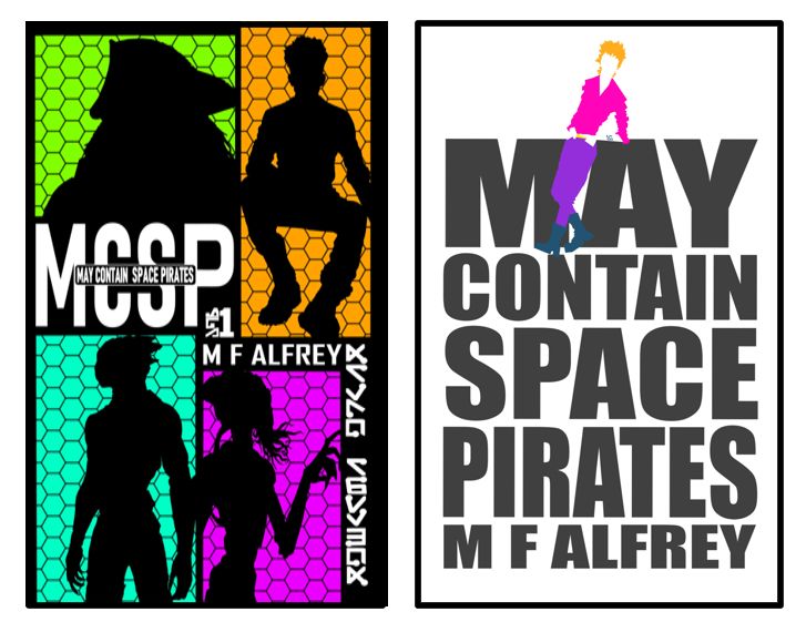
The first cover was inspired by one of my fave animes, Cowboy Bebop, and I hoped the link would convey the humour and story style. It was also the same time I was going through my silhouette phase. The cover has all the crew on the front to communicate the anthropomorphic characters, but devoid of features as I didn’t want to limit what readers saw in their own minds when reading about Fifty-eight and characters like the feline Amanotto, and reptilian Minbuana.
The trouble with this cover was the title was way too small and lost in the images. So, what did I do? I went right back to the alternative cover I had originally agonised over. Why the agony? Because it was just so bold and brave and I wasn’t at the time. But here it is now: big, bold and in your face! Just like the story itself. Fifty-eight is on the cover too, though I stuck with my instinct to leave the details up to my readers and left his features off leaving a whimsically bold cover.
Click here to browse May Contain Space Pirates on Amazon
Silentium
This was a love letter to my most favourite movies and stories of all time: Aliens and The Thing. Is it derivative? Probably, but I don’t care. I had to write it, and it has turned out to be one of my best sellers so far, with readers telling me it had some genuine shit-your-pants scares, which made me smile so much.
So, naturally I wanted a scary cover for it, and it had to be white to reflect the snow and ice in the story. Again, working with silhouettes, I created many versions of the creature yet wanted to keep it abstract in order to preserve some mystery. The same with the title font which I wanted to reflect its inspiration: the opening title for John Carpenter’s thing. Though, admittedly I went more black metal with it to reflect the creeping spread of the virus central to the book. The resulting cover was awesome (I thought back then). Can anyone actually read it? Probably not without squinting at it like a magic eye picture.
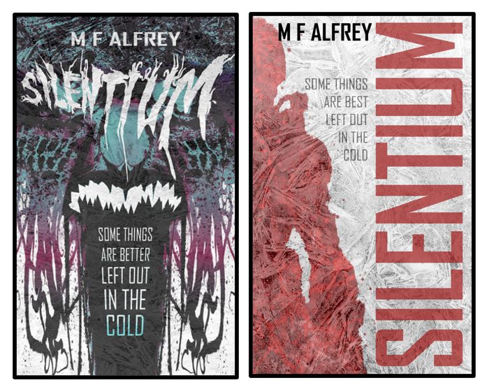
The new cover keeps big and bold in mind but also scaling for thumbs on social media and sites like Amazon and Tik Tok. Again, I went for an original design I drew called the Bloody Soldier, depicting an IPC marine on the front cover and on the back, the mutated result of the virus. I ran with the blood soaking into ice idea and tweaked the original image which can be found on old ads for the book.
The cover is a lot frostier now and I chose to go with a bold sideways title people can actually read. The original black metal logo is still in the book because it’s awesome. When you spread the book open to look at the full cover, you’ll be able to see the soldier transforming into a mutated creature on the blurb side, which was the original intention and I think is kind of fun.
Click here to browse Silentium on Amazon
There you have it. A little insight into the history of these book covers and my journey as an indie author and cover artist. Being indie is hard work and pretty much learning as you go, and of course there are stumbles and misses. However, I’ve found if you stick at it, and accept the occasional hard truth (black metal logos, although cool, are hell to read) then it can be a pretty rewarding journey. This batch of covers has taught me a lot as an indie author and artist. But what is the biggest lesson you’ve learned, I hear you say? It is this:
Pay close attention to the file location you are saving your work to.

Leave a comment